Moving from desktop to mobile meant rethinking the entire user flow. Every tap and swipe had to feel natural and intuitive.
 All work
Mobile editor
A mobile-first editor that empowers users to create and customize visual content on the go.
- Role
- Product designer
- Team
- Designer, 2 engineers, QA, tech writer, content marketer
- Company
- Venngage
- Focus
- Mobile, touch interaction
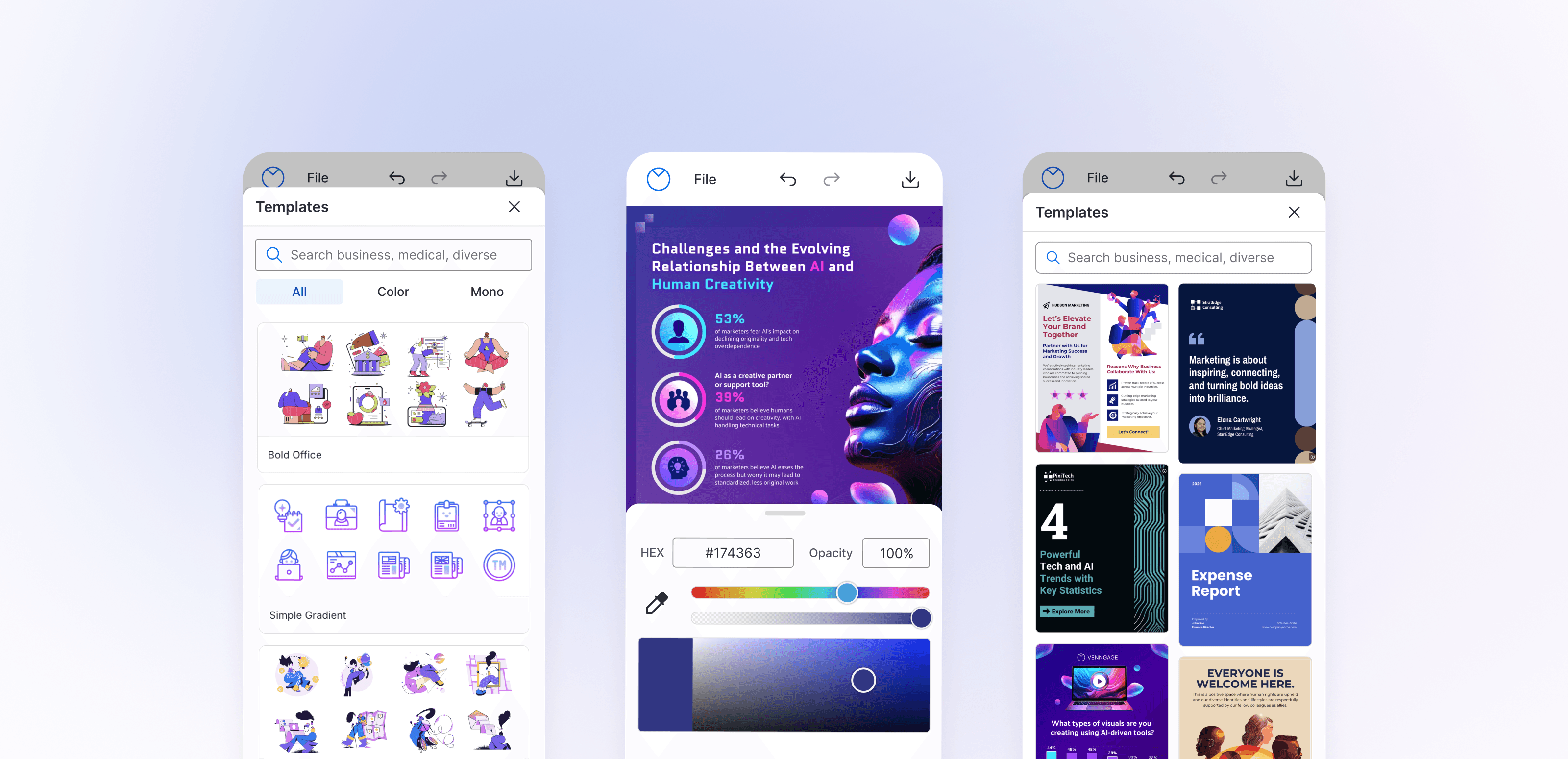
- Mobile registration
- +44%
- 16% to 23%
- Creation rate on mobile
- +30%
- More users finishing a design
- Drop-off
- −28.5%
- Users could now fully use Venngage on the go
Problem
A missed opportunity
Venngage users were abandoning the platform because they couldn’t edit on mobile. 16% of new registrations came from mobile, but 55% of these users dropped off. They could browse templates but couldn’t edit or customize them—a major barrier, especially for users with diverse needs.
Phase 1 of 3
Laying the foundation
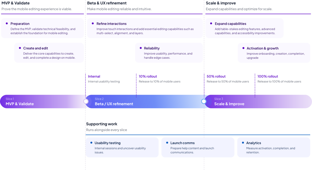
We aimed to release the MVP in three months. With a small team of two developers and me, I wore multiple hats as both UX/UI designer and product manager. To turn the vision into a plan, I created a roadmap that broke the work into three release slices.
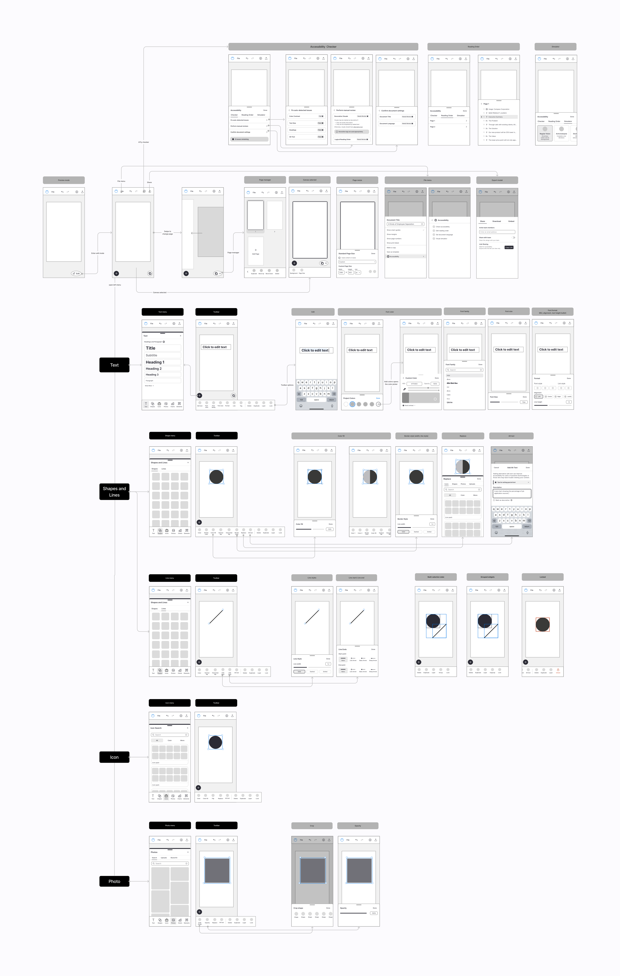
With the plan in place, I designed wireframes as a flow map of the whole editor. Starting from the canvas, each element type (text, shapes and lines, icons, and photos) branches into its own flow, tracing every step from creating an element to editing it in the design.
Phase 2 of 3
Refining touch interaction
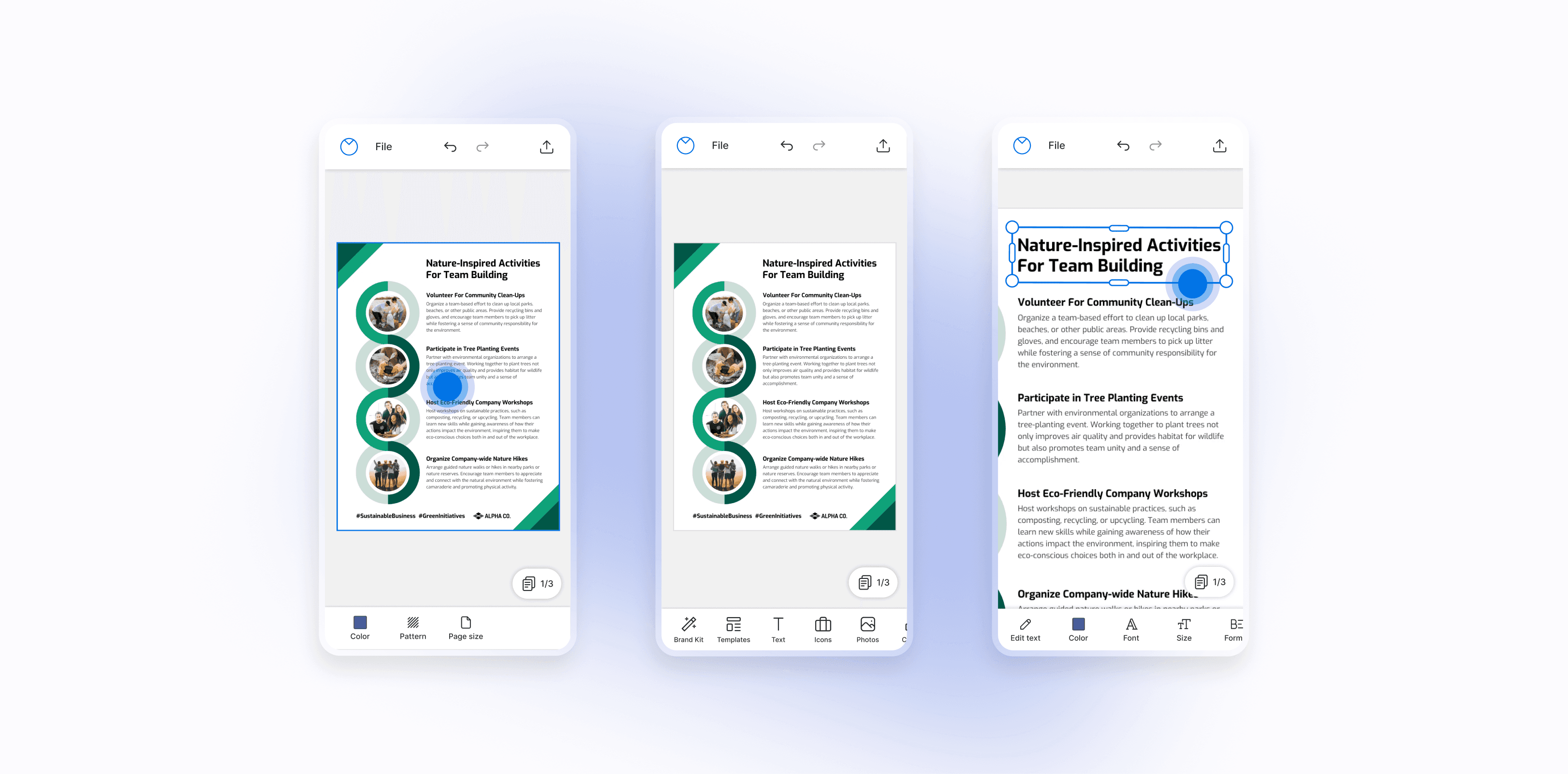
Early testing revealed critical issues: unresponsive gestures, jittery panning, accidental misclicks, and difficulty selecting and moving elements. Over the next 2–3 weeks, we refined pinch-to-zoom and pan, tap to select, drag to move, and scaling and rotating, then refined features to overcome the limits of smaller screens.
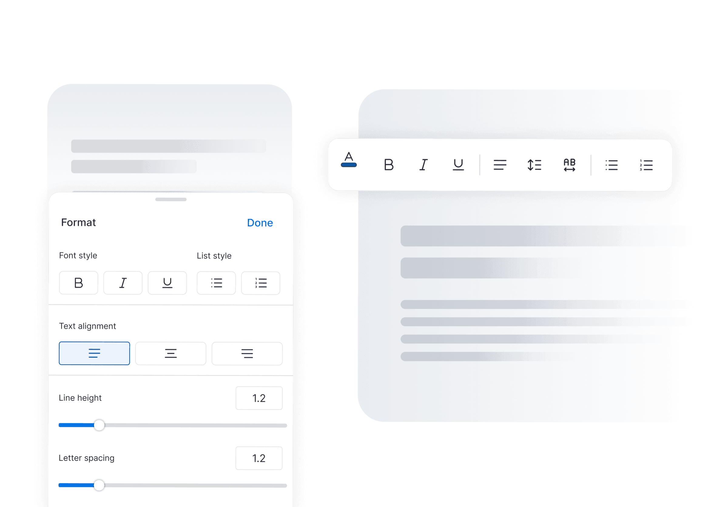
Toolbar drawer
- Problem
- The long desktop toolbar didn’t fit on mobile, and squeezing it in left tools too small to tap.
- Solution
- I redesigned the long desktop toolbar as a mobile drawer with touch-friendly target sizes.
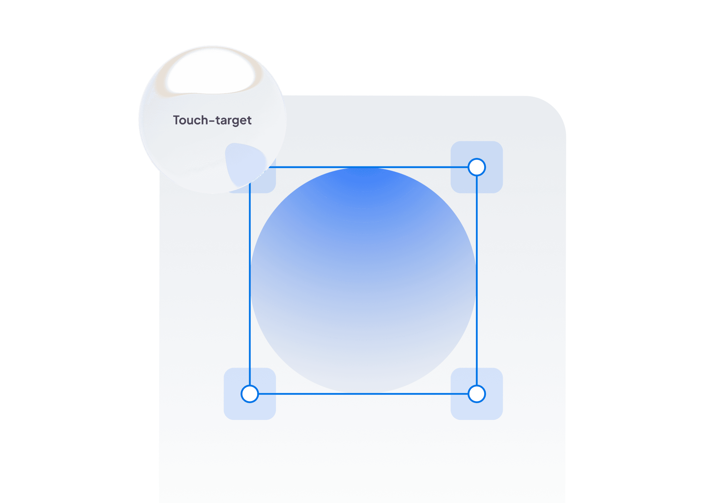
Better bounding box handles
- Problem
- Small handles made resizing hard on mobile.
- Solution
- Increased handle size to 44px for better touch accuracy.
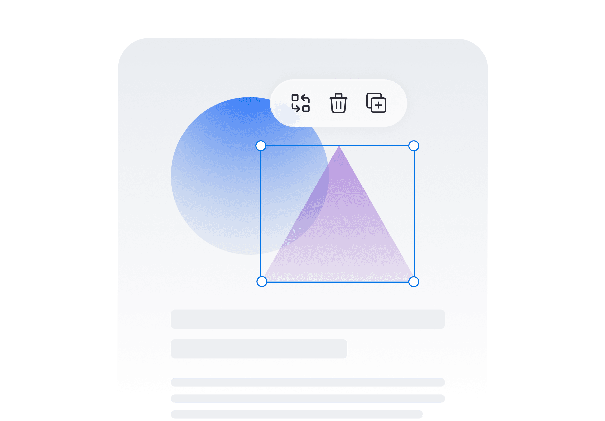
Quick action menu
- Problem
- Key actions were buried in a scrolling menu, which slowed down quick edits.
- Solution
- A floating menu on the canvas puts key actions one tap away. It was later adopted on desktop too.
Phase 3 of 3
Mobile editor goes live
Before launch, QA tested the editor across devices and mobile operating systems, and I ran internal usability sessions with Venngage employees to catch bugs and edge cases early. We then rolled it out in stages, from internal testing to 10%, 50%, and finally 100% of mobile users, so we could fix issues before they reached everyone. Alongside the rollout, I wrote help center articles and FAQs and worked with marketing on launch announcements.
Like most MVPs, the first version wasn’t perfect, but it was an important first step. Launch was just the beginning, with plenty of work ahead to refine and enhance the experience.
Learnings
Reimagining the mobile experience
Wearing multiple hats
Balancing product strategy and design taught me the importance of aligning user needs with technical feasibility.
Eat your own dogfood
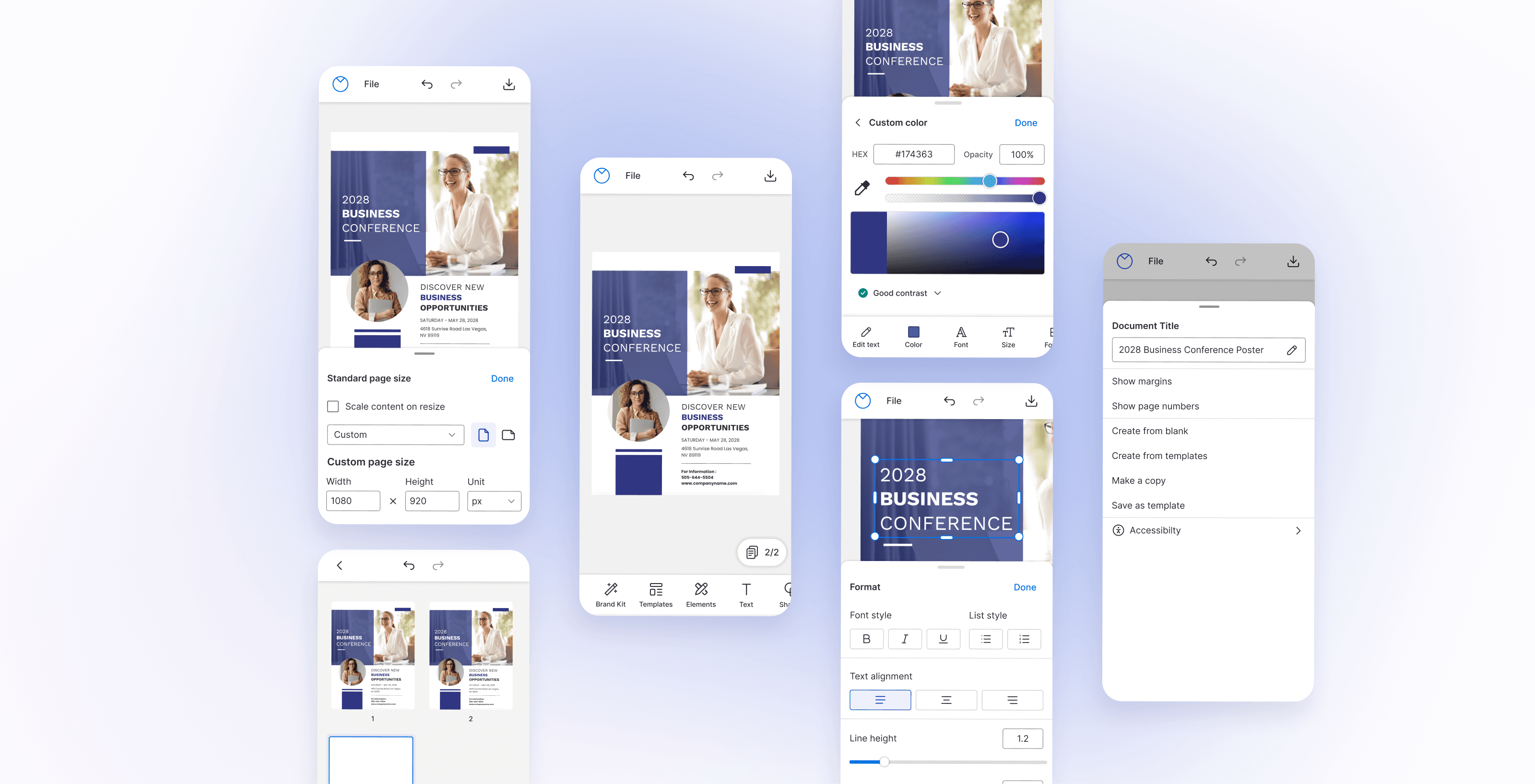
By using the mobile editor ourselves, we found pain points early and fixed them before the final delivery.