A public university administrator who must make student-facing documents accessible each semester, with no time to train teams or audit manually.
 All work
Design editor / design system
A powerful design editor that enables professionals to create accessible, compliant documents—without requiring technical expertise.
- Role
- Lead product designer
- Team
- PM, Designer, EM, 3 Engineers
- Company
- Venngage
- Focus
- Accessibility, design systems
- Compliance + VPAT
- WCAG AA
- Trusted by education, healthcare, nonprofits
- Used a11y features
- 15%
- In their first session; 20% made accessible designs
- Accessibility leads
- 50+
- Within three months
Problem
Compliance without the expertise
For many of our users, especially in government, education, and enterprise, accessibility isn’t optional. These teams must produce accessible documents at scale but often lack the technical expertise, so they’re stuck with complex remediation tools like Adobe Acrobat Pro and CommonLook PDF Validator.
I redesigned our editor from the ground up: rebuilt the design system, designed new accessibility features, and rethought key user flows with inclusion in mind. This effort earned VPAT certification and strengthened our credibility among business users.
Who we designed for
Three personas
With the PM, we ran 15 discovery interviews across compliance-driven industries, which surfaced three distinct user types. Catherine is our primary ideal customer profile (ICP).
Catherine Johnson
Accessibility advocate · Primary focus
Darron Mitchell
Business-first executive
Operations director balancing accessibility against budget and business priorities.
Zeo Anderson
Screen reader user
Accessibility specialist slowed down by poorly structured documents and inaccessible PDFs.
Phase 1 of 3
Accessible at its core
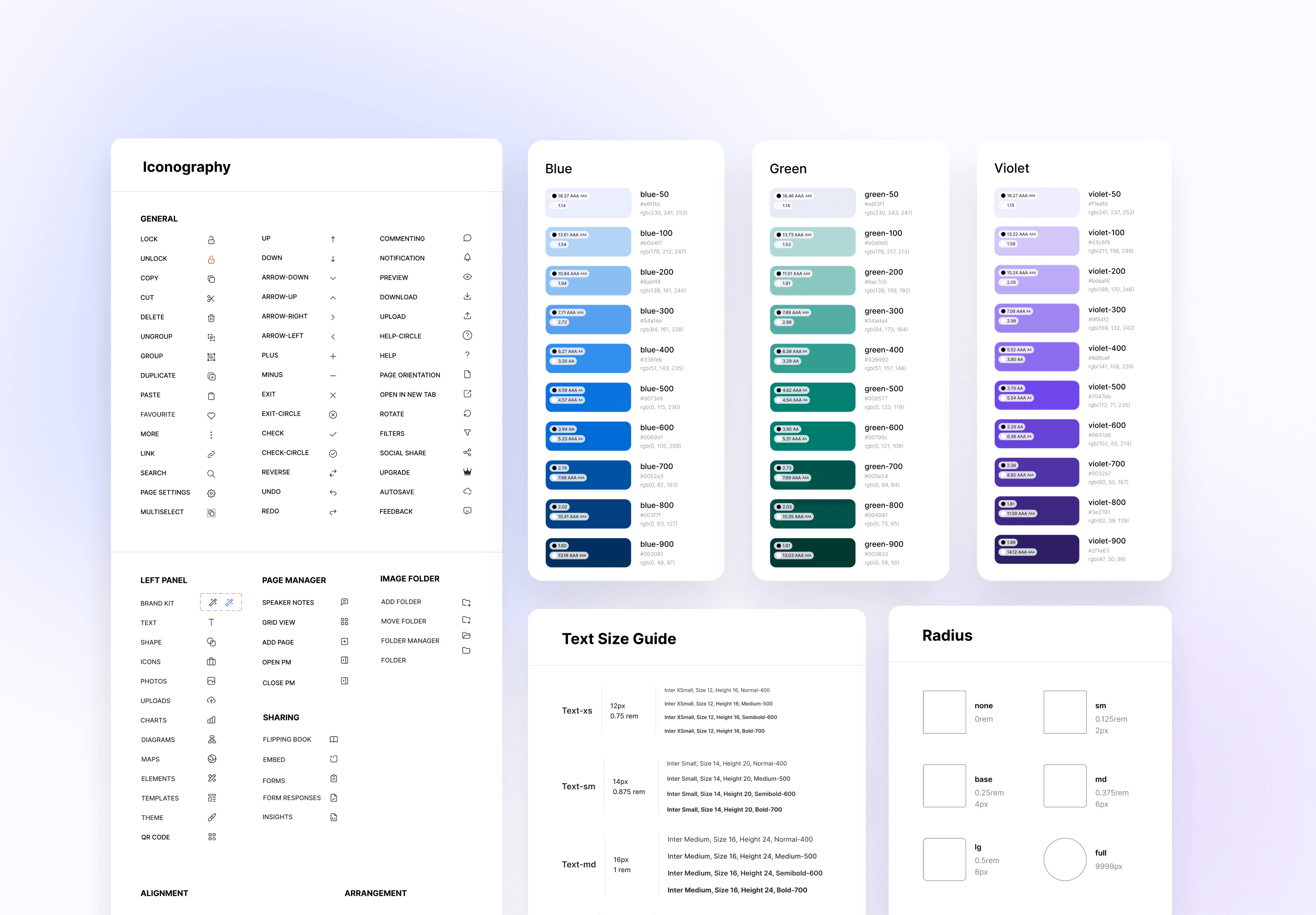
I took ownership of rebuilding our design system to meet WCAG 2.1 AA, with contrast-compliant palettes, legible typography, accessible iconography, keyboard-navigable components, and guidelines for inclusive writing. This redefined our visual language, increased design velocity, and streamlined handoffs.
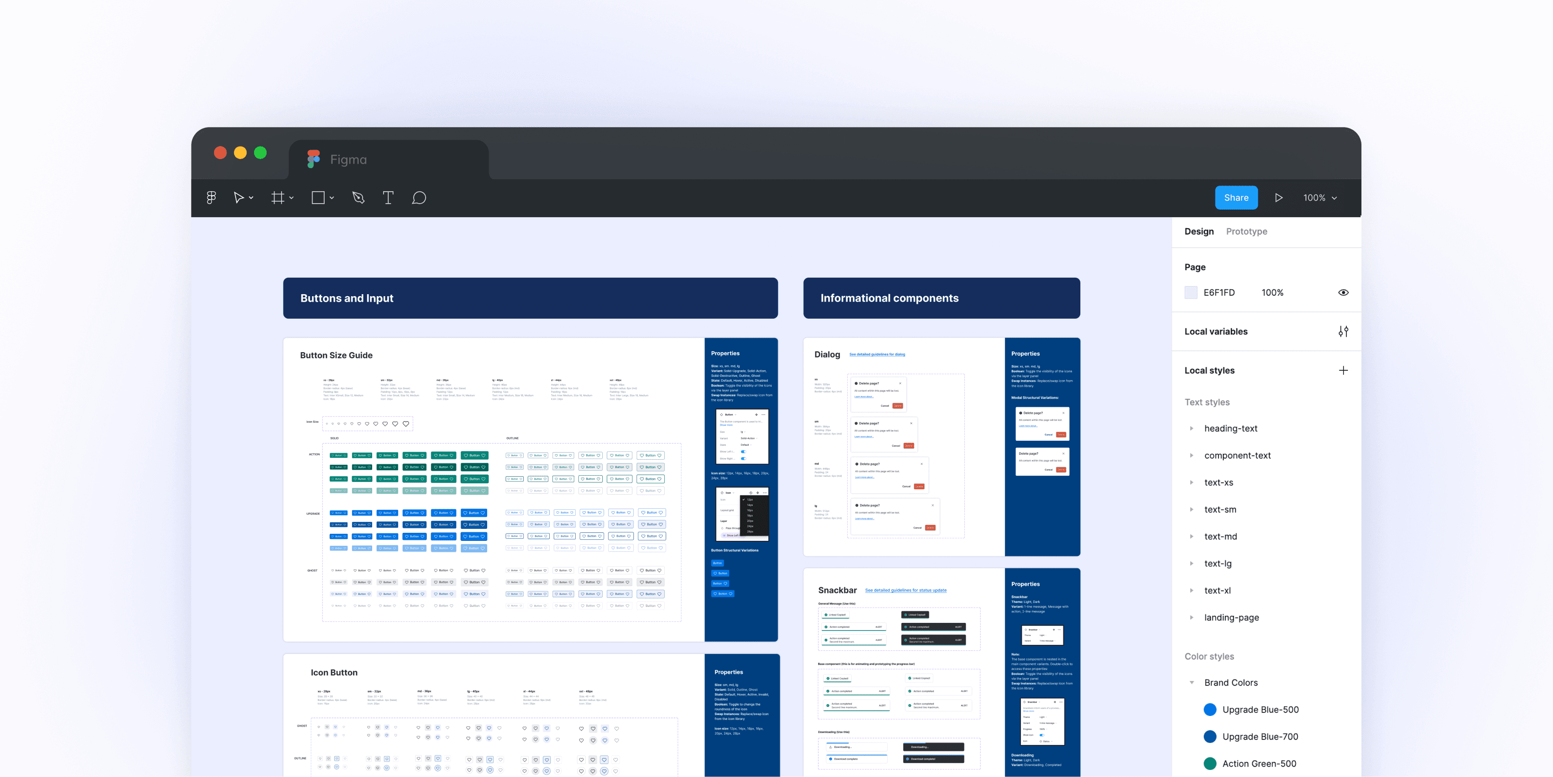
Components
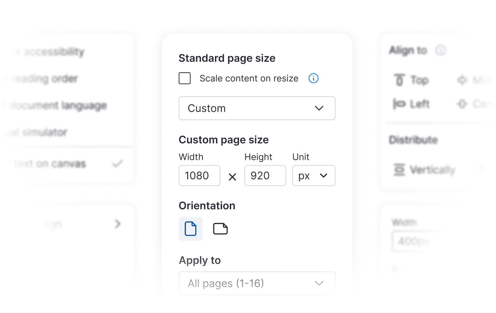
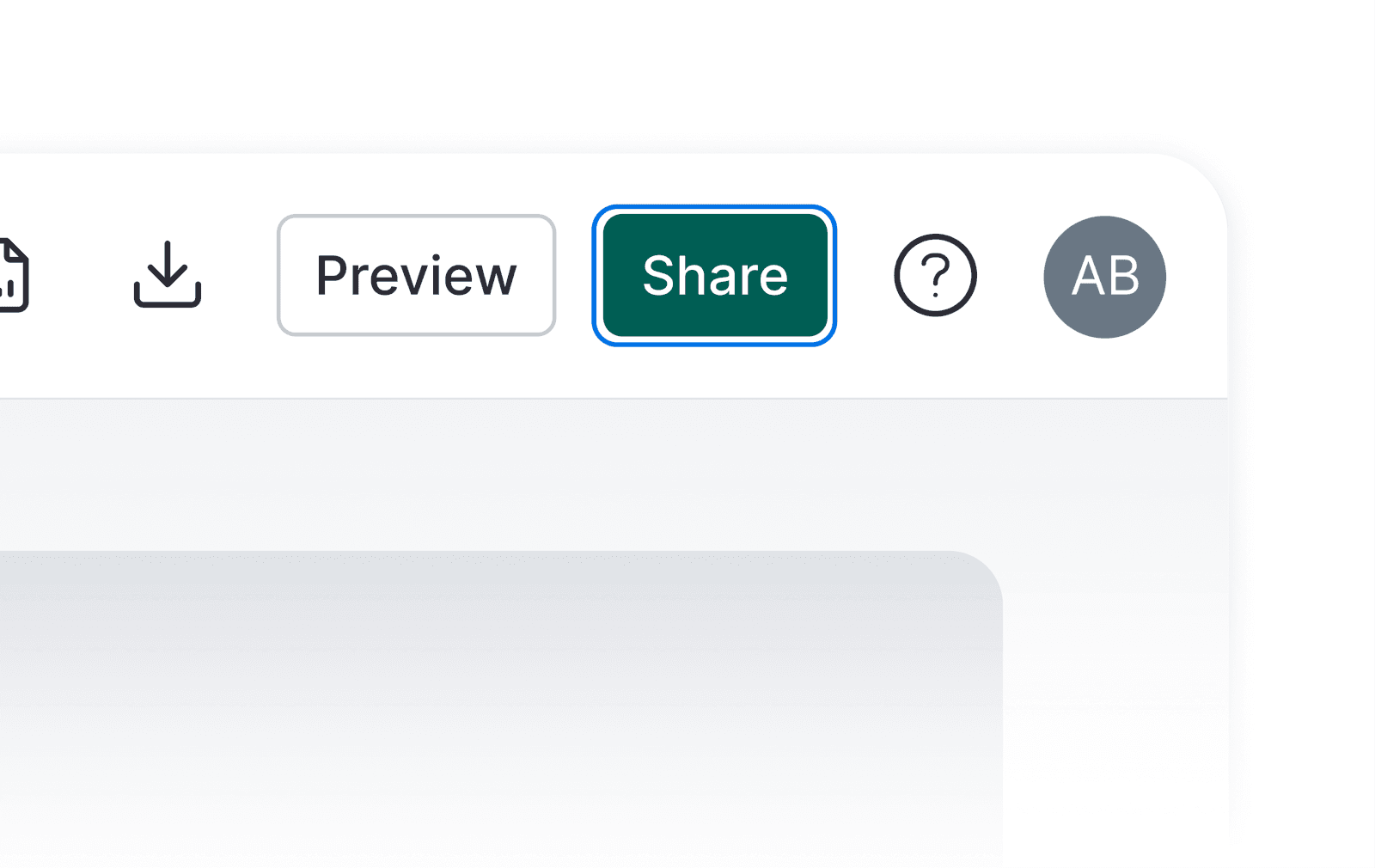
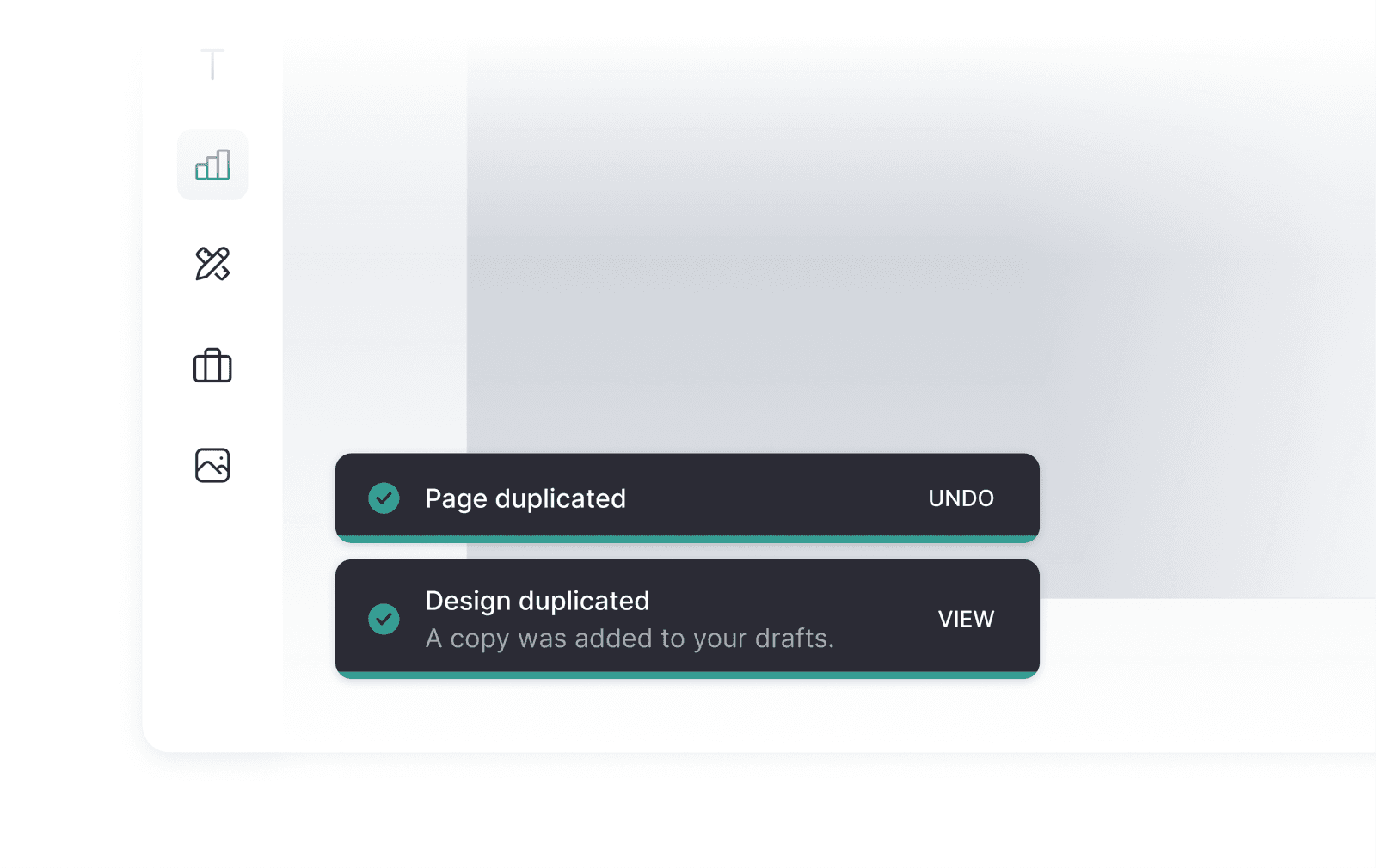
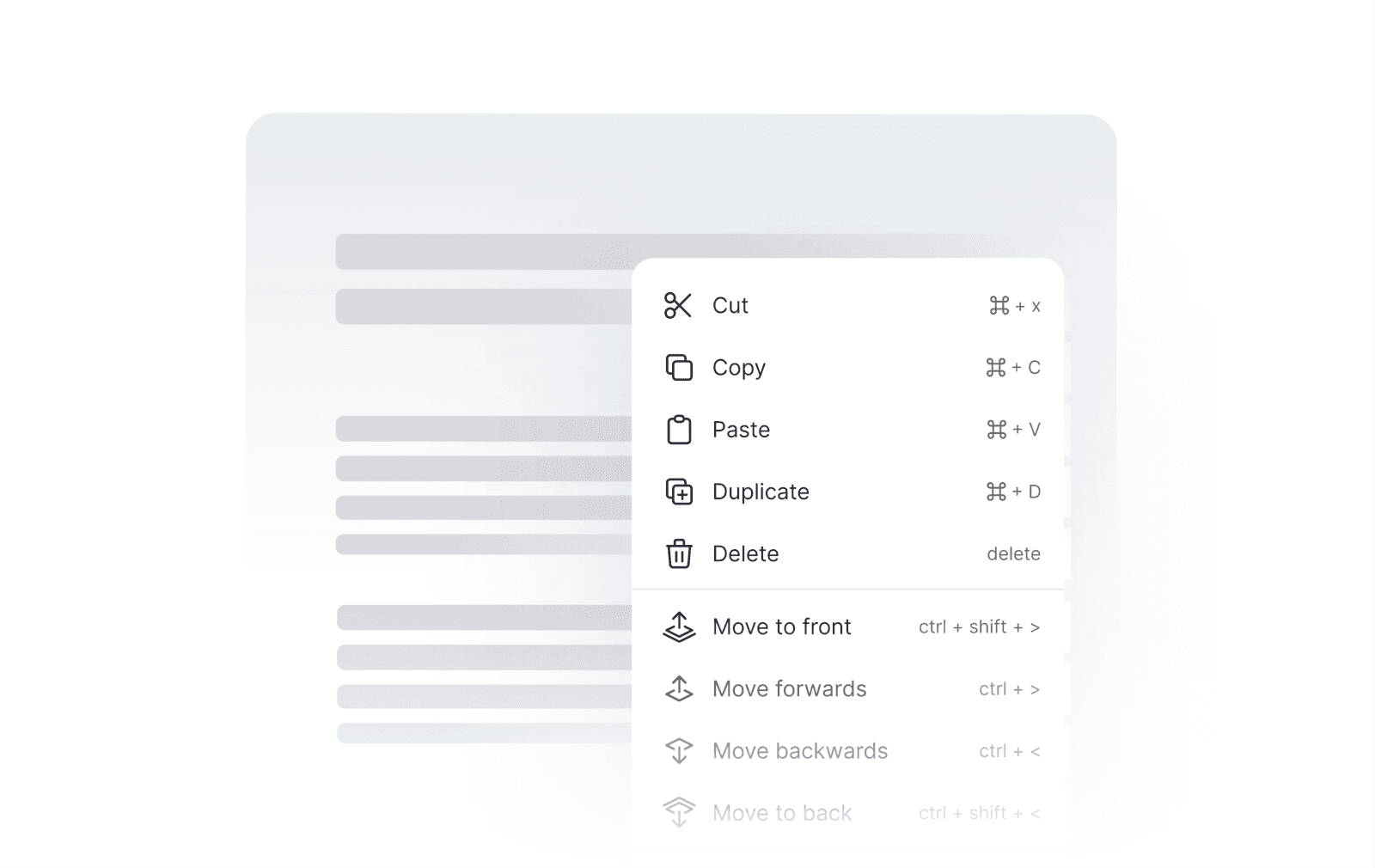
I partnered closely with engineers to add ARIA labels, intuitive tab navigation, and full screen reader support, making the editor fully accessible for people like Zeo. Building on this foundation, I redesigned the editor with a cleaner UI and stronger visual hierarchy.
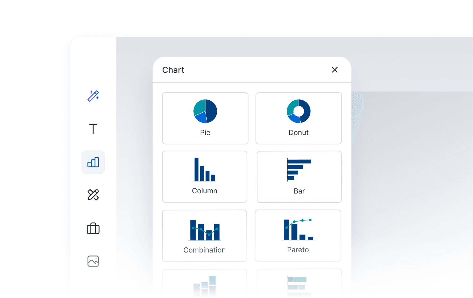
Modernizing the interface
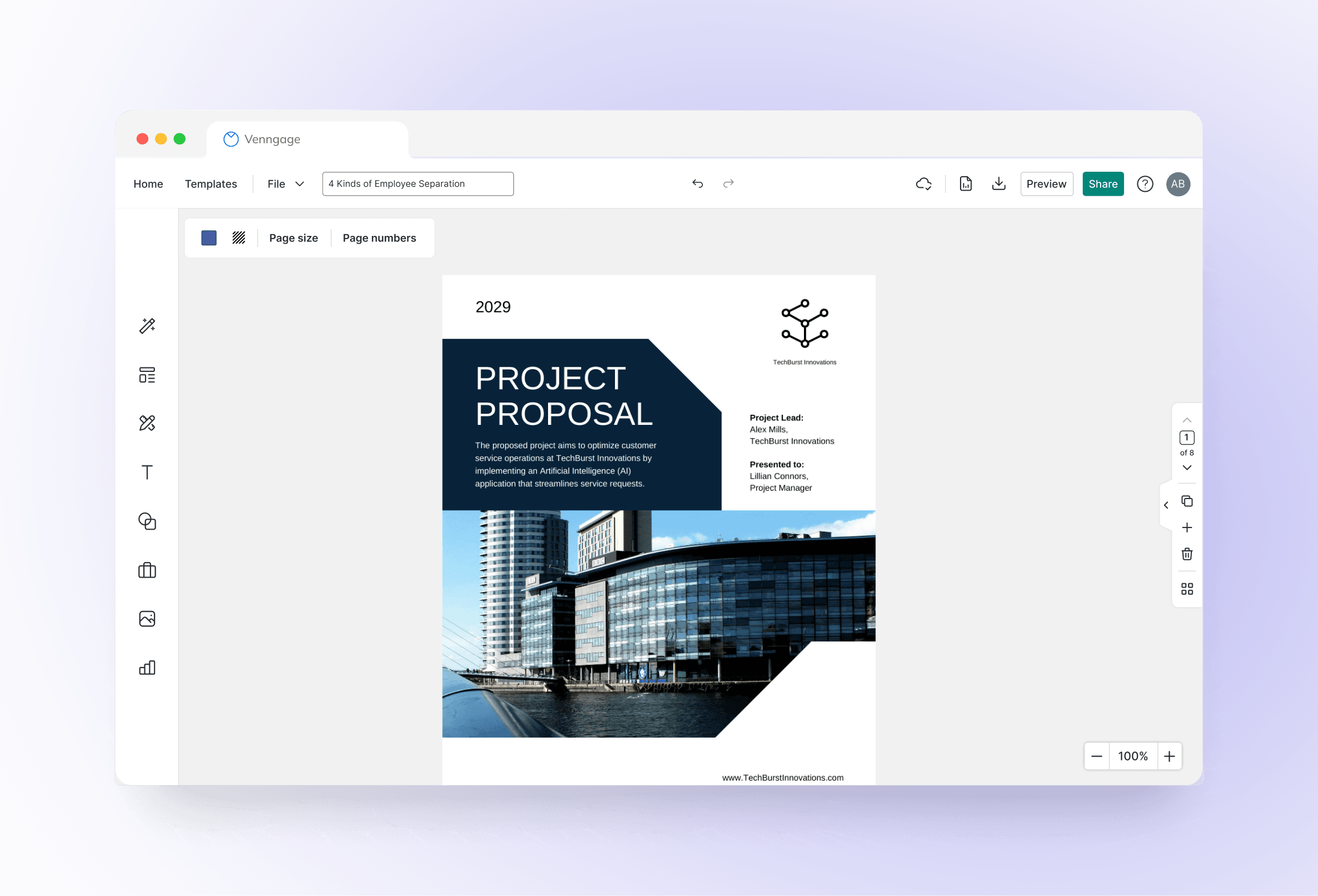
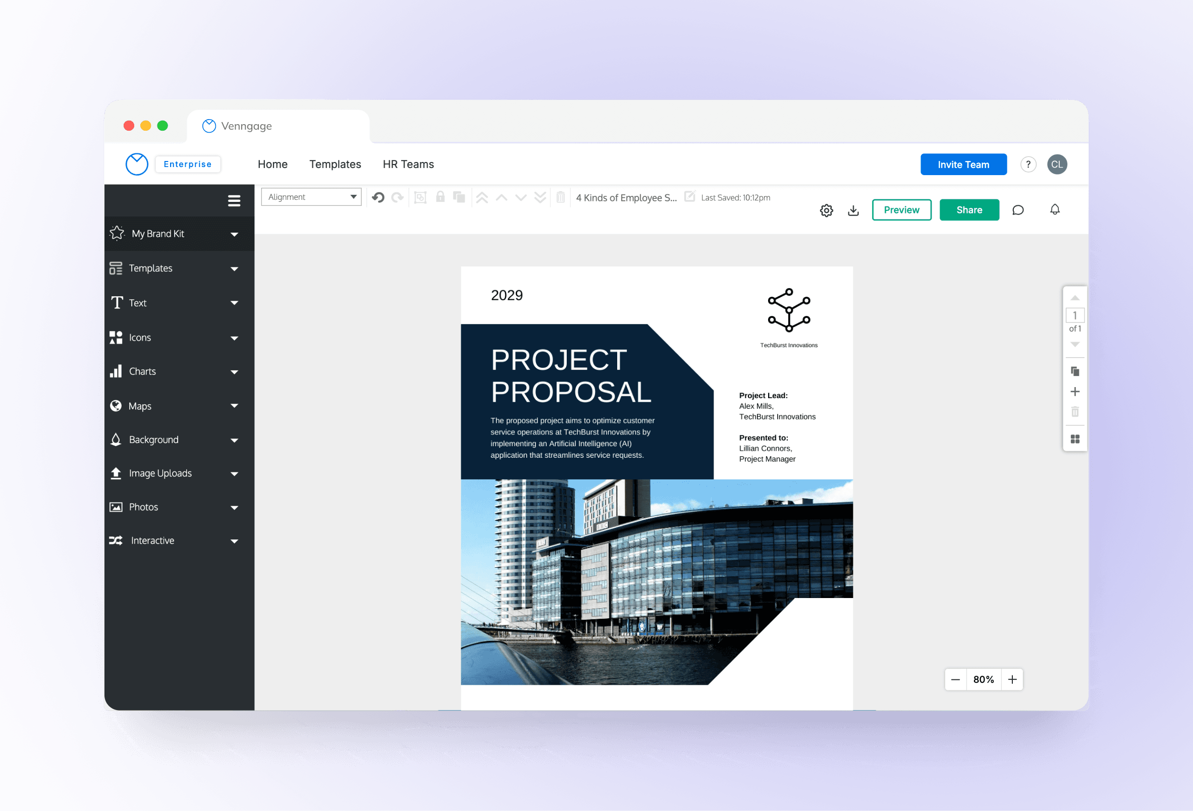
Building on this foundation, I redesigned the editor interface with a cleaner UI and stronger visual hierarchy. I ensured consistent styling and full WCAG Level AA compliance, making it more intuitive for all users, including those with low vision or motor impairments.

Phase 2 of 3
Making accessibility part of creation
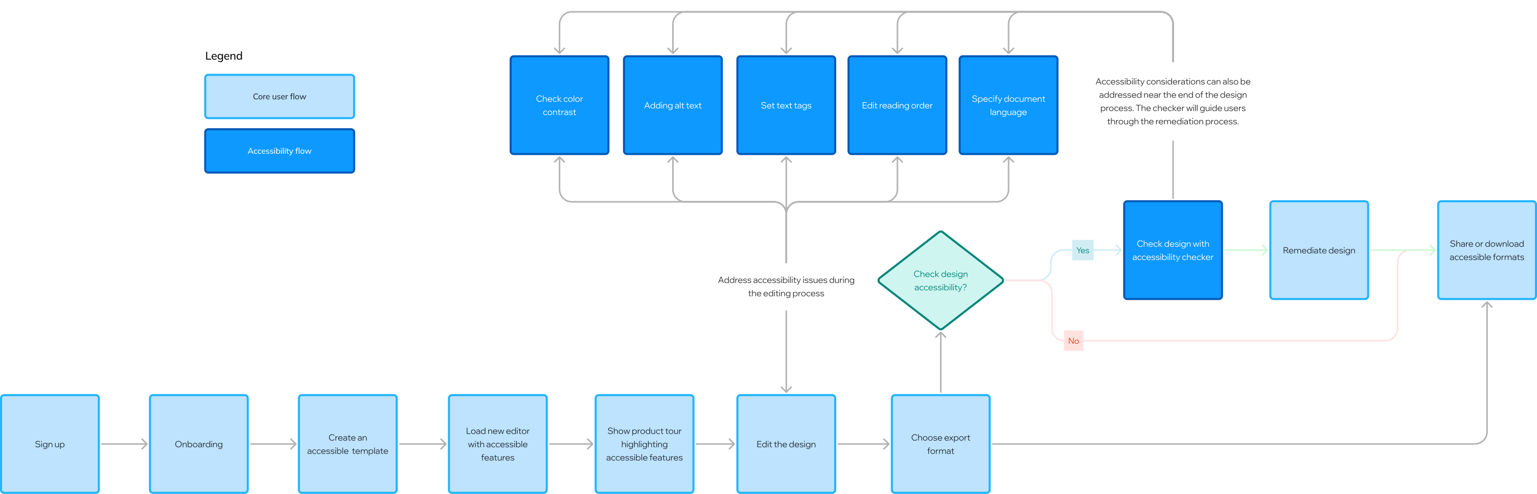
Accessibility shouldn’t be a final step. I built guidance into the moment of creation, so people like Catherine can make accessible choices without specialist knowledge or outside tools.
100%
Feature highlight
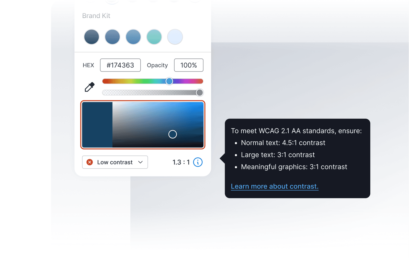
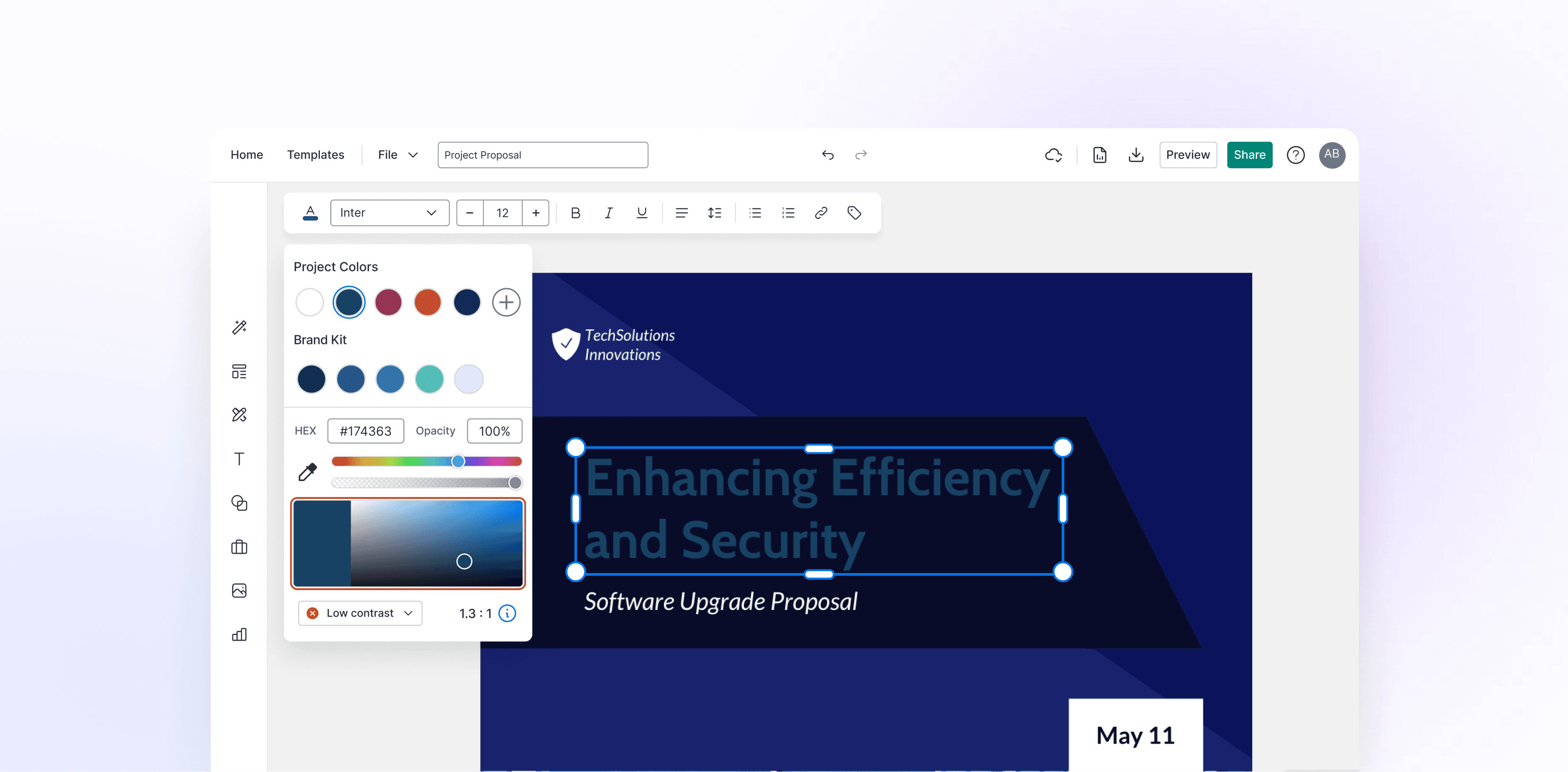
Real-time color contrast checker
Users like Catherine had to use third-party contrast checkers, adding extra steps to her workflow. I integrated a real-time WCAG 2.1 AA contrast checker directly into the color picker. It evaluates selected colors, warns users when combinations fail, and suggests accessible alternatives.
Usability testing
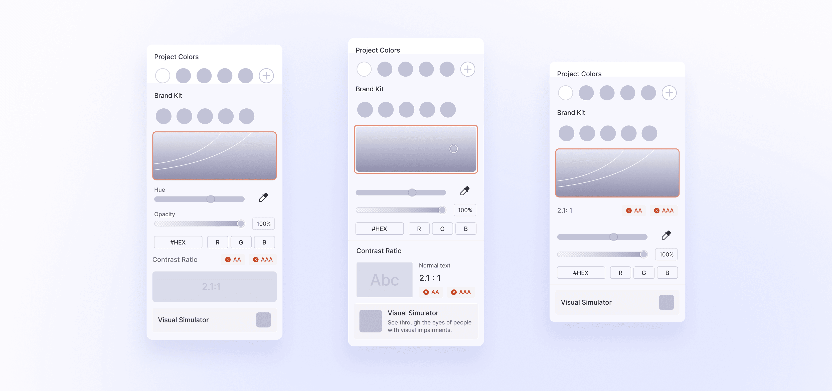
To find out what actually helped users choose accessible colors, I tested three versions of the menu, each combining different ways to surface contrast:
- Live contrast ratios with WCAG AA levels
- Contrast borders around swatches
- Highlighting the accessible range in the picker
- A visual simulator for perspective switching
Goal
Find out whether users could pick accessible colors confidently, without leaving the editor or needing to understand WCAG.
Format
- Moderated and unmoderated usability tests with 8 users
- Example tasks: “Choose an accessible text color for this heading” and “Fix a low-contrast button”
- Measures: task success, time to pick an accessible color, confidence rating
What I found
- Version 3 performed best: contrast tags linked each color to its accessibility result.
- Users preferred simple pass/fail feedback over technical contrast ratios.
- Real-time previews added little value.
Result
- 63% task success: 5 of 8 users chose an accessible color on the first try.
- Confidence increased: 2.8 → 4.2 / 5.
- Next opportunity: Users wanted AI-generated accessible color palettes.
Final version
In the final design, the contrast tag sits right next to the color picker, so users know instantly whether a color works as they choose it. A plain-language label (“Low contrast,” “Good contrast,” or “High contrast”) updates live with every change, and users can click the tag to see the exact ratio and WCAG level.


Phase 3 of 3
Validate accessibility before publishing
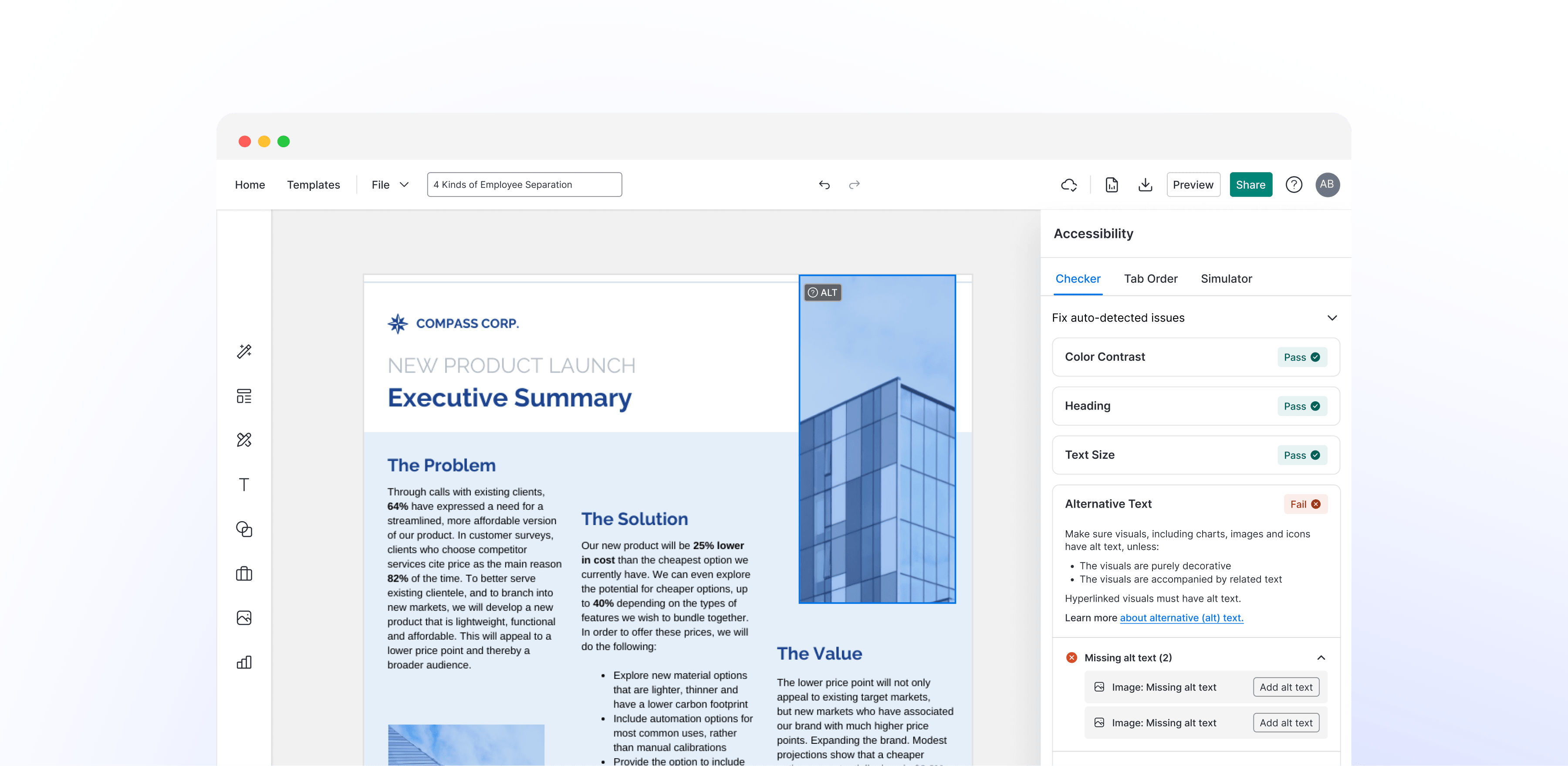
Catherine needed a final review before publishing, but external tools like Adobe Acrobat had a steep learning curve. I designed an all-in-one accessibility checker with automated audits, fixes linked directly to each feature, and a full accessibility report.
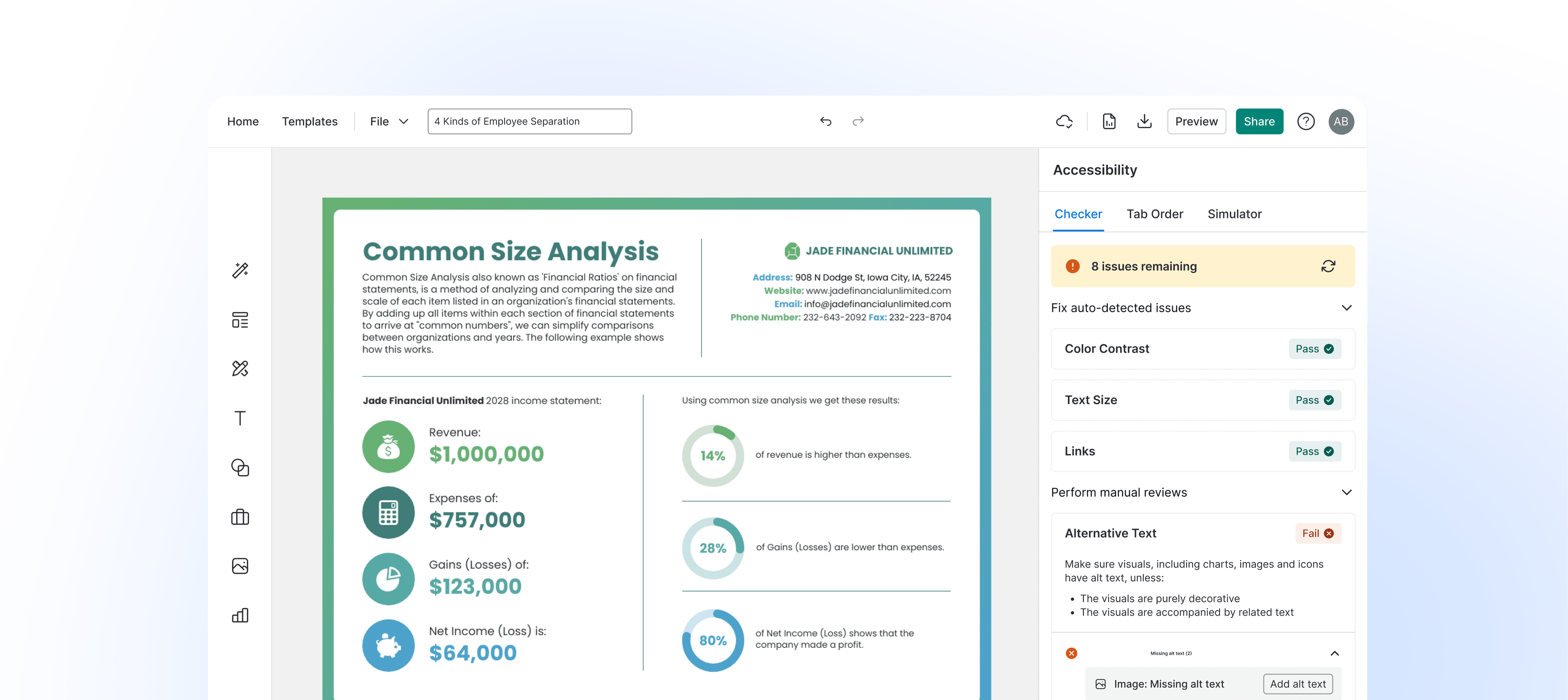
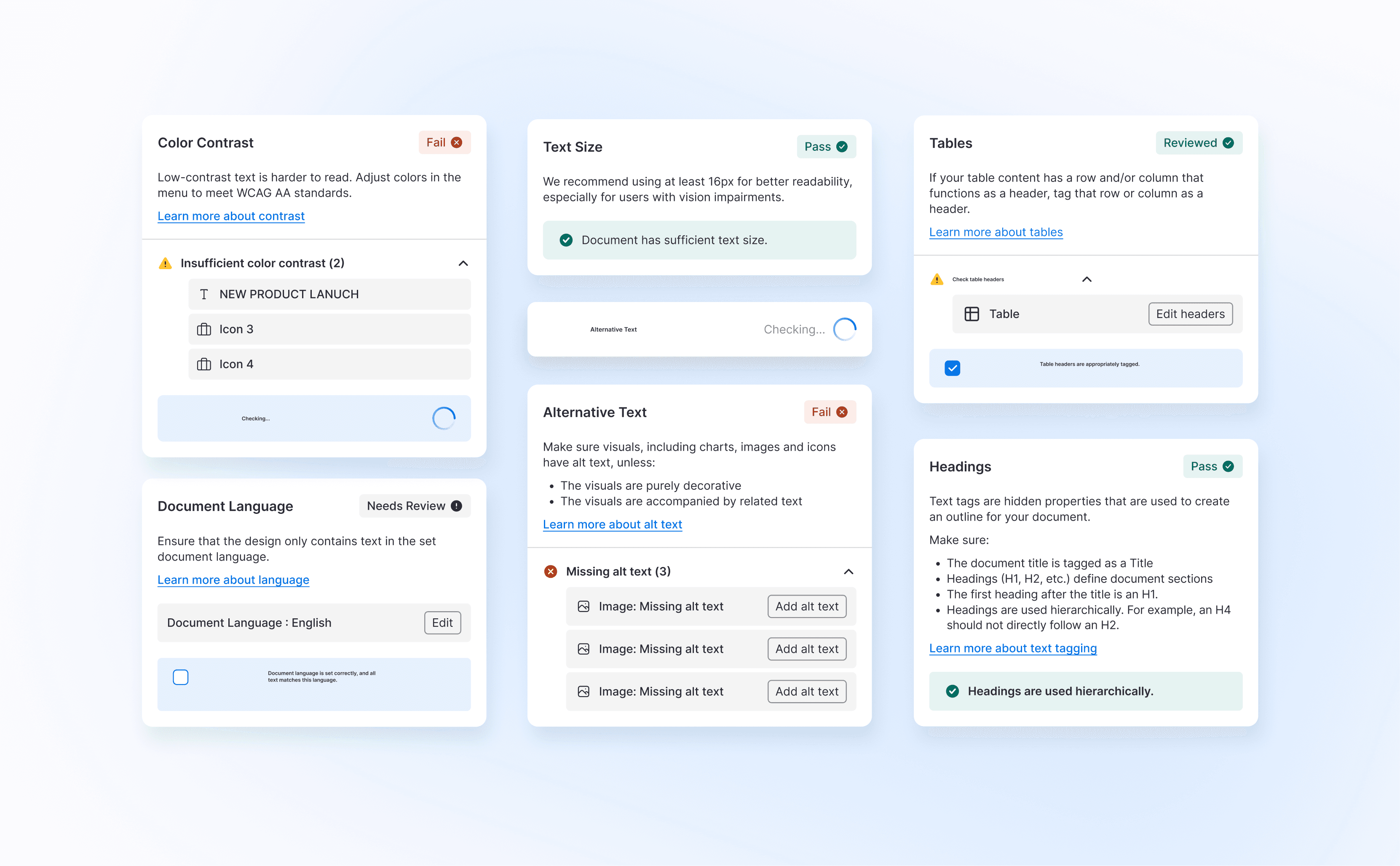
I built an all-in-one Accessibility Checker that audits the whole document before publishing. It flags issues like missing alt text, low color contrast, and small text, and links each one straight to the tool that fixes it.
It combines an automated audit with guided manual review across 11 WCAG AA categories, marking each one as pass, fail, or needs review. Automation catches what’s measurable, like missing alt text or low contrast. Manual review covers what needs human judgment, like whether alt text makes sense or color alone carries meaning.
Learnings
Design with accessibility in mind
Accessibility goes beyond a checklist. It’s a mindset that should shape design decisions from the beginning, not be added at the end.
Co-creating with users
Talking with users like Catherine, and experiencing the product with a screen reader, helped me close the gap between best practices and practical, intuitive design.
Take ownership and keep learning
I rebuilt our design system with accessibility at its core, strengthening both the product’s design foundation and my Figma skills along the way.